Like Unforced Errors in Tennis: UX Blunders and Team Commitment
How Simple Mistakes Reveal Deeper Issues in User-Centric Design
I often use Pocket, primarily because it seamlessly works across various devices. While there are native alternatives like the reader mode in many browsers Pocket stands out for me.
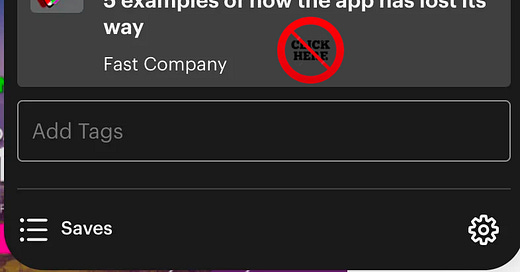
Previously known as "Read it Later," Pocket can be cumbersome when you want to "Read It Now." The issue arises when you add a site to Pocket: the notification that appears doesn't allow you to directly click on the article to view its content immediately. Instead, you have to navigate to Pocket and select the article from there—resulting in unnecesary clicks. Basic UX.
Such a user experience error might occur in any software application. However, considering that Pocket was founder in 2007, has millions of users, received $14.5M in funding, was acquired by Mozilla, and lists 55 employees on LinkedIn, one would expect a more professional approach.


